Today in News History
On June 28, several notable moments in the history of News stand out. In 1882, The Anglo-French Convention of 1882 marks the territorial boundaries between Guinea and Sierra Leone. In 1919, The Treaty of Versailles is signed, ending the state of war between Germany and the Allies of World War I. In 1923, Adolfo Schwelm Cruz, Argentinian racing driver (died 2012) was born. In 1930, Itamar Franco, Brazilian engineer and politician, 33rd President of Brazil (died 2011) was born. In 1934, Georges Wolinski, Tunisian-French journalist and cartoonist (died 2015) was born. In 1942, World War II: Nazi Germany starts its strategic summer offensive against the Soviet Union, codenamed Case Blue. In 1956, Noel Mugavin, Australian footballer and coach was born. In 1981, Guillermo Martínez, Cuban javelin thrower was born. In 1982, Ibrahim Camejo, Cuban long jumper was born. In 2013, Ted Hood, American sailor and architect (born 1927) passed away. Together, these milestones provide historical context for today's news news and ongoing narratives.
This long-forgotten signage from Argentina is World Cup design at its best

When designers for the 1978 World Cup in Argentina designed a signage and wayfinding system for the tournament, they needed something that would be easy to read and scale. Their forgotten work was ingenious and economical—and it’s finally getting its due. A new book takes a look back at Argentina’s World Cup signage system through the instruction manual that put it all together. Manual of Standards: Signage, FIFA World Cup ’78 Argentina faithfully reproduces that original standards manual, and it allows for a close look at a fascinating rendition of pre-digital wayfinding. The system took a grid-based approach, but was also completely modular: made from buttons affixed in patterns on a perforated panel to make shapes, symbols, and letters. [Photo: Flecha Books] And yet, despite being among the largest sporting events in South America in the 20th century, the 1978 World Cup design system has been largely forgotten. That might have something to do with the military dictatorship that ruled the country up until 1983, and a collective desire to leave it in the past—a kind of anti-nostalgia. Now, publisher Flecha Books is hoping to draw attention back to the designers’ work. The book, printed to the same standards as the original, is available for preorder until July 19 for 55. [Photo: Flecha Books] “In the last century, almost every sports event has been revisited from a design point of view, especially the Olympics, but also a few World Cups,” graphic designer and Flecha Books cofounder Francisco Roca tells Fast Company. “This was one of the largest sports events in South America at the time and also the first Argentinian systematic design solution or work for a large event, so it’s kind of special.” Though unique, this wasn’t the first World Cup brand or wayfinding system. For that year’s tournament, though, organizers needed a standardized signage system that could be deployed across six venues that would be cheap to produce in large volumes. The solution was the system outlined in the standards manual and called Puntograma, Spanish for “dot-a-gram” or “point-a-gram,” a comprehensive grid-based system that workers on-site at stadiums could assemble themselves. [Photo: Flecha Books] Puntograma used a modular grid on dark green perforated steel panels that were manually assembled with individual white polypropylene buttons inserted into the perforations to make a cohesive shape or image, like a Lite-Brite toy. There were also red buttons reserved for warnings. The system was designed by designers Carlos Méndez Mosquera and Gus Bonsiepe at the Argentine studio MM/B. The firm also handled the rest of the 1978 World Cup’s industrial design, including seating and venue equipment. That industrial design mindset found its way into their modular, scalable signage. [Photo: Flecha Books] The comprehensive graphic system for the 1978 World Cup used a typeface that took its proportions from the sans serif Univers, set at 80 height, which Roca says they’re working to recreate as a font. It also included arrows; pictograms for restrooms, restaurants, cafés, and other amenities; and logos for each stadium. For the venue in Mar del Plata on the coast, for example, the logo featured waves; for Córdoba near the Sierras Chicas mountain range, it showed a mountain; and for Mendoza in Argentina’s wine country, it used grapes. “Design-wise, it was a really clever and ingenious and different and approachable solution,” Roca says. And now it’s getting a much-deserved closer look.
Narrative Intelligence Brief
This article was published by Fast Company, a source frequently categorized with a lean left bias based in United States of America. Our narrative intelligence engine continuously monitors coverage from this outlet to track framing, bias, and rhetorical patterns. Our initial algorithmic scan of this specific piece did not flag high-confidence rhetorical techniques, suggesting a generally straightforward reporting style or neutral framing. By understanding the editorial perspective of Fast Company, readers can better contextualize the information presented and compare it across our broader media matrix to find the real narrative.
More from Fast Company
June 27, 2026
3 simple tips working parents can use to create more free time
June 27, 2026
The government wants to rein in powerful AI, but there are downsides
June 27, 2026
Zillow downgrades its home price forecast. Here’s its outlook for 400-plus housing markets
June 27, 2026
Try these 3 Google Flights hacks to get the best deals on summer airfare
June 27, 2026
Why mid-career women are leaving corporate America for entrepreneurship
Analysis Methodology
This narrative analysis was generated using the CoDataLab Global Intelligence Engine. Our proprietary AI scans thousands of cross-border sources to identify sentiment patterns, framing techniques, and potential media bias. While AI provides the data-driven foundation, our objective is to empower readers with additional context beyond the standard headline.The content displayed above is a structured summary designed for rapid information processing. For the full original report, please visit the source outlet.More Coverage
Discussion
"cup"
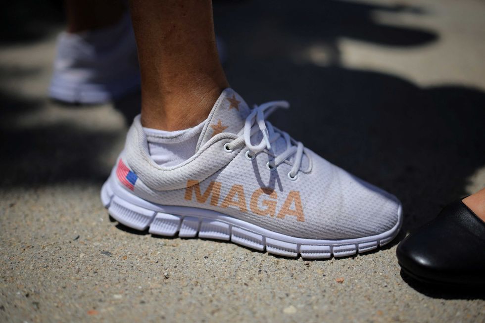
This nuclear message is built to stomp MAGA — and it isn't corruption
Ghana showed what they are capable of — just far too late against Croatia to avoid a damaging defeat
/https%3A%2F%2Fsportsmole-media-prod.s3.gra.io.cloud.ovh.net%2Fuploads%2F2026%2F06%2Fimago1078920974-1-6a406682ac983771606326.jpg)
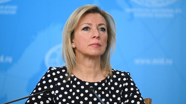
Russia Will Not Leave Russia Flag Ban at Romania Competition Unanswered – MFA Spox